
Monday, 19 October 2015
Sunday, 18 October 2015
David Carson - Ray Gun Magazine
.
David Carson is best known for his designs for the front cover of the alternative music and lifestyle magazine Ray Gun in. The magazine sold over 70 issues from 1992 - 2000, featuring famous music icons such as: Oasis, Radiohead, Red Hot Chilly Peppers and Pearl Jam. One thing that would gain the attention of the public eye, would be how unconventional Carson's magazine covers were. His magazines explored a very abstract style. A lot of the time, most of the magazines were very hard to read.

Many of Carson's designs were different every time the magazine was published, and never had any of the same features. Looking at some of the front covers, we can see how the magazine doesn't include the typical features you would expect it to. For example, most covers wouldn't have any sort of cover lines or datelines. Another component that goes against the conventional magazine cover, is how in some of the magazines, Carson puts the barcode in different places, not always in the usual right hand bottom corner


Thursday, 15 October 2015
Representation
Miss Representation

After looking at different magazines and exploring how men and women are represented, there is a clear difference. For example, we look at front covers of magazines and we can immediately see how the men are portrayed as strong, tough and macho, when women are pictured as gentle, but more often as objects. GQ is a well know respectable magazine, however we can see how the woman on the front are clearly photographed as a spectacle for men to look at. As there are so many other magazines that do the exactly the same thing, it's not a surprise that in 2011, 53% of thirteen year old girls are unhappy with their body, because they have an unrealistic idea of what women and girls should look like. Even women who are known for their respectable jobs in the world, such as politicians or news presenters, are still sexualised and are only talked about when referring to their clothing and appearance.


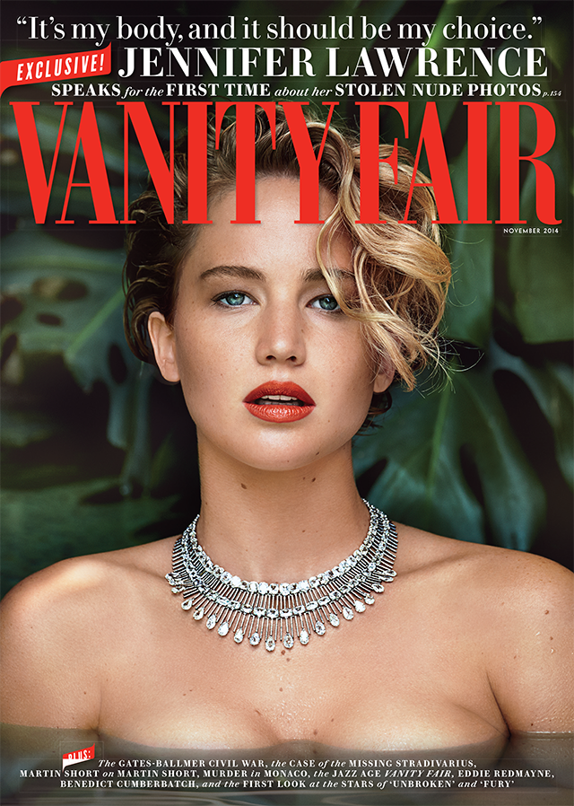
After watching the documentary "Miss Representation" it has become even more apparent to me how women are seen as objects, and something of much less value than a man. It's not a surprise to anyone that we today, live in an extremely patriarchal society. However after watching the documentary, what did come as a surprise to me was that, in 2011, only 16% of protagonists are women. Even then, the women in these movie roles are sexualised and are made to be desirable for a specifically male audience. Not even in children's movies are portrayed differently, but are still seen wearing a significantly small amount of clothing.
.jpg/revision/latest?cb=20131206061022)
Facial Expressions - Marjorie Ferguson
In the 1980's Marjorie Ferguson identified four different ways in which women are shown in British magazines. Ferguson showed how magazine covers could be shown as: Chocolate Box, Invitational, Super Smiler and Romantic or Sexual.

The Chocolate Box
This cover is usually shown with the model with a closed mouth smile, and has used a full or three
quarter face to the camera.
The cover would normally try to project a feeling a warmth, as well as showing the model
with nothing but perfections.

Invitational
This cover typically has a big emphasis on the eyes or the mouth of the model. Usually, the models
body will be turned away, but their face facing the camera. With this cover
there is a projected mood of mystery. The smile would often create a sense of sexuality

The Super-Smiler
It wouldn't be surprising to find a windswept model, showing a full tooth smile
It wouldn't be surprising to find a windswept model, showing a full tooth smile
with their chin up and a very aggressive "look my way" type of mood.

Romantic or Sexual
This cover would normally include more than one person on the front, typically
a male and a female in a very sensual position. The models would not be smiling
and look. The models would have less clothing to seem "available"
The Male Gaze Theory

The idea of the Male Gaze Theory came about in 1970 by a woman named Laura Mulvey. Mulvey strongly argues that in film, women are only present for the masculine eye to be gazed at and objectified. Her idea suggests that in film, the camera would act as the eye of a heterosexual man who would want to show women the way men want to see them.
Mulvey shows us that this can be shown as:
Men look at women
Women look at Women
Women look at other Women
In movies, there is no other way that women are shown apart from sexual characters, innocent characters, or the incredibly bitchy boss. In so many movies, you will find that whatever the genre of movie, if there is a young female character, the camera will just so happen to find itself positioned on the women's slightly clothed body for the rest of the movie, simply to make sure the men are happy. This has become so normal in our society that nothing about this theory is questioned, and since film was created no one in the directing career has changed the way we victimise women and put them in front of the camera to just be looked at.

For my magazine
After looking at how men and women are represented in the media, I can see how it can be difficult for editors to create work that will stand out in the market as well as producing a magazine that won't have to follow along the steps of a "typical magazine". For my magazine, I don't want to put out the same messages as all of the other magazines, that would only create false image for both girls and boys. If I were to have a woman on the front of my magazine cover, they wouldn't be presented in a way that is only desirable for men, but in a way that other women and girls will be able to relate to. I would want to show that women can be just as powerful as men, and maybe not use the typical functions of magazine covers such as Marjorie Ferguson's facial expressions, that would make women seen differently to men. I would want my magazine to be able to represent all kinds of people, and would not just use a white female who would attract the attention of white males. I want to make sure my magazine can appeal to any sort of ethnic group.

Thursday, 8 October 2015
Preliminary Task

Evaluation
For my preliminary task, I made a magazine cover for the new sixth formers that began Southfield this year. My target audience for this magazine would be 16-19 year old boys and girls. The masthead for the magazine has different font sizes. The "Southfield" is written in a bigger font, so it should be the first thing that would get the attention of the audience. The masthead also includes the smaller words saying "sixth form" so the audience would be clear on the content of the magazine. All of the masthead is written in the same colour which stands out against the white background, all of this would be the first thing the reader would see. Also next to the masthead, I have put a date for the magazine.A weakness of my magazine cover, is the fact that I haven't used capital letters at the beginning of my cover lines, which i think could have made the magazine look more formal and more powerful when being read. Also another weakness of the cover is that I have missed out an important feature of a magazine cover, the main cover line. I think I could have made the font of one of my cover lines bolder and a larger font so it would stand out more and catch the audiences eye. One positive of my cover is how the masthead is able to stand out clearly against the white background of the photograph, so it would be easy for the target audience to identify and want to read the magazine.

For my contents, I used the same colour schemes as the magazine cover. A weakness of my contents page is that it is quite simple, and might not be as encouraging for the target audience to carry on with the magazine. However, the contents page does include images from students around the school, which might motivate the readers to read the rest of the magazine, and maybe join the school sixth form.
Saturday, 3 October 2015
In-groups & Out- groups
Social Identity Theory
Tajfel proposed: that the groups which people belonged to were an important source of pride and self-esteem. Groups give us a sense of social identity: a sense of belonging to the social world.
Some of these groups could have included social class, family or a football team.
In certain groups, members will try to improve and enhance their image so that their group can also be enhanced. Another way group members will increase their image is by acting intolerant towards other groups and discriminating them.
By acting in this way, naturally people become divided. The world of "us" and "them" comes into place and people are put into social groups. "in-groups" and "out-groups". The idea of social identification, is how people in these groups will act and behave, including opinions and attitudes which would be accepted as a norm in these particular groups.

Mods and Rockers
The mods and rockers were two British subcultures that were conflicting throughout early 1960s and 1970s. The Mods would often dress in tailor-made suits and wear Doc Martens and desert boots. Most Mods would listen to RnB music, as well as soul. Rockers were usually dressed in leather jackets and motor bike boots, also with turned up jeans. Rockers would listen to a lot of Rock n Roll.
During the time of the mods and rockers, many fights broke out due to the dissimilarity and the social comparison. A famous conflict between the two social groups took place in Brighton(1964) on the beach, where physical fighting became severe.

Magazine Analysis

Subscribe to:
Comments (Atom)