Sunday, 24 January 2016

FINAL MAGAZINE!!


Pop Identities

Shey

Gender: Female
Age: 15
Location: UK
Occupation: Singer
Music Genre: Pop
Number of singles: 3
Number of albums: 1


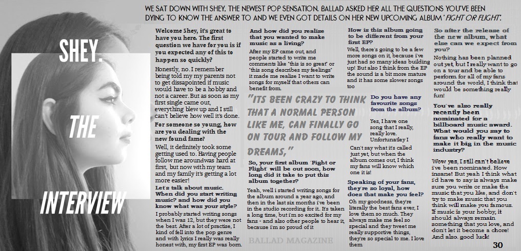
Shey was born and raised in the heart of London with an unstoppable passion for music. By the age of 16 she had been around England in search of possible labels she could get signed to. Finally before the end of the year, she was offered a record deal that helped release her first album "Fight or Flight"

Shey's music is mostly songs that you'd find in the charts, pop with some RnB
Many of her songs are upbeat that are easy to have a good time to, however Shey has a couple of songs that are slower and more heartfelt.

She has a style than can be recognised by most teenage girls, She enjoys to wear simple clothes, but likes to glam up when she gets up on stage. Shey enjoys simple activities such as hanging out with friends, reading and most of all singing and writing music.


Friday, 4 December 2015

Good and Bad Magazine Covers


Whilst doing research for my own magazine, I came across some really good examples of what a magazine should look like, and how well they would sell, but I also came across some really awful examples of published magazine covers filled with mistakes.
This first magazine cover was published with a photograph of Kristen Stewart. This has to be one of the worst magazine covers because of the way she's standing and her facial expressions make the magazine look dull and not very exciting. It may be easy to guess that this magazine might not have sold as many copies as one of their issues with a slightly more awake model on the front.


 The Glamour magazine is also such an obviously bad magazine cover because of the way the model has been photo shopped, if you look at the model's right leg, you can notice how it is much smaller than the left leg. This is something that I will have to keep in mind when doing my own magazine. If I need to edit my photograph in any way, I will try to do it subtly and not make publish any big mistakes that will make my cover look unprofessional.


However, there are many good examples of well made magazines that I've looked at to compare my magazine and use them as inspiration on how I should try to make mine.
For example, this cover of Angelina Jolie includes many of the typical magazine front cover features and the photograph suits the style of the magazine, as well as not having any edited mistakes left in the final published copy. The magazine also looks professional and the colour schemes all match. The black, white and grey give it a simplistic style, which is what I am aiming to produce for my magazine.


Photo-shoot

For my first photo-shoot, I wanted to have a darker background so I could use the light from the street lamps as an effect. We visited a couple of locations, where I took some practise pictures for what I might want to use for the front cover as well as the double page spread. At the end of the shoot there were a couple of pictures I thought would be effective, one of them did end up to be on the front cover.
I also did another shoot with a lighter grey background. I found that I wanted my magazine's theme to be black and white, so I kept with taking pictures using that effect. I wanted the lighter pictures to show more of the models face, which compared to the darker images would have a good contrast. For the second photo-shoot, I used actors headshots as inspiration, and I wanted my model to be fully facing the camera, with nothing hiding her features.
After taking all of my pictures, I experimented with some colour filters, such as a blue effect and sepia, after doing so I found that the simple black and white ones were more effective and looked more professional. I took a couple of pictures only capturing my models eyes and half of her face because I wanted to experiment with slightly more unconventional styled pictures.
Although I really liked the pictures, after asking a few people it became clear that those type of pictures would not fit in with my genre of magazine.


Tuesday, 1 December 2015

Planning my Magazine

Before I start to make my final magazine pieces, I wanted to play around with a few ideas I had to see if they would work, and which software I would be able to use to give the best outcome.

Front Cover Ideas


Contents Page Ideas


Double Page Spread Ideas


Friday, 27 November 2015

Mood Boards + Research

Fonts


For the font, I was thinking about going for something that could found on other popular magazines. I preferred the bolder styles of font and I thought that if I were to use a more thinner font, I would use all capital letters in the title. By researching different font types, it has helped me to better understand the conventions of a magazine cover that is aimed at a mass audience and to choose the right font that would fit my genre of magazine.

Artist Genre


These are the kinds of artists that inspired what my model would look/be like. The fact that I had chosen a pop based magazine, I wanted to base my artist on well known chart singers, such as Justin Bieber, Taylor Swift and Ed Sheeran, all artists that would attract a younger audience. All of these singers are also mostly pop singers, which is what my artists would be similar to. This research also helped me to form content for my double page spread, by finding out what kind of questions these artists are asked and the way they go about answering them, helped me to put my questions together and to then form a response.

Location


 For the location, I wanted to visit mainly outdoor places so I could use a natural background without having to edit it. Even though many of the places I wanted to shoot looked nice. However from this research of different locations, it became clear to me that if I wanted to have the main focus of the magazine cover on my model, a noisy background would take away the effect of the model. For this reason I decided to still use an outdoor background, but in a way that it was subtle and would not take the audiences attention away from the model.

Music Magazine Covers

Many of the magazine front covers I researched were pop, or loosely based around pop culture. One thing that helped influence my final product is the way pop magazines layout their cover lines. I noticed that the main cover line would generally involve the biggest story (almost always about the featured music artist) and the other cover lines would give more insight into the rest of the magazine. One other thing from the research that helped my decisions on how to  make my front cover, was the position of the title. In my first magazine daft the title was a small size and spaced out, but after looking at other pop magazines, I realised a more effective and professional looking title would be bold and large, either in front of the model or behind.

Layout Ideas


Monday, 16 November 2015

Reader Profile

Demographics

Gender:                          Female
Age:                               17
ABC:                             C1/DE
Occupation:                   Student/Part time Job
Disposable Income:      £100
Education:                     Sixth Form/A Levels
                                      Media
                                      Politics
                                      English
                                      Psychology
Nationality:                   British

Psychographics

A "normal" 17 year old A level Sixth Form
student who is interested in music as well
as her hobbies such as photography and sports.
When she spends time alone, this person will
listen to mainstream pop music, but is open to
finding out about new artists other may not
have heard of. When she spends time with her
friends, they like to go to the cinema to watch
new movies or to the theatre to watch live
productions of well known performances.
She enjoys a lot of things to do with art and creativity.
She plays a few instruments and likes to paint
in her spare time, when she is not doing school work.

Likes: Good music and films, shopping,
playing instruments, spending time with friends,
CD collecting.

Dislikes: Racism, injustice, bad music
and films, people shouting in public.