Thursday, 14 April 2016

Looking back at your preliminary task, what do you feel you have learnt in the progression from it to the full product?

For my preliminary task, I had to make a magazine front cover and contents page for my school. When looking back at my preliminary task and my final media product, there is a clear difference between the way the two have been created and finished. 

Looking at the front cover for my preliminary task, you can see how the models on the cover are not facing the camera, therefore the effect is not as great as the other cover because of the lack of eye contact. Another thing that is noticeable of the preliminary cover is how there are only cover lines on one side of the page, in my final product I learnt that in order to make the magazine look much more professional, and to suit the style of magazine, I would have to include more cover lines, as well as making them different sizes to show variety. One thing i learnt from my preliminary task was that I should use colours that would compliment each other, as well as making sure that they were easily visible and could be understood. The cover lines on the preliminary task are hard to read because of the colours in the photograph. From this, when I took the photographs for my final product, I wanted to use a darker background in order to make the font of the front cover to stand out and look effective.
 
Unlike my preliminary task cover, my final product had a picture that I had taken time and went through many pictures to decide which one I thought looked the best. After taking many pictures for my magazine cover then deciding which one was the best, I edited the picture to get rid of any imperfections in the background, so that the picture was the main thing standing out to the audience. I also learnt from my preliminary task that it would be much more effective to have all of the models facial features seen clearly. In the preliminary one of the models has had some of her face cut out from the front cover which makes it look much less professional.
 
One more thing I learnt during the time it took making my final product was to use a variation of font types and sizes. In the preliminary task, even though I have used different colours, and one other font size, the cover lines look very similar and it is because I had used the same font through out the whole of the front cover. Keeping this in mind, for my final product I made sure to use variation of fonts, colours and sizes to make it look much more interesting to look at,


Looking back at my contents page from the preliminary task, there is another difference from the final product. One thing i learnt about the contents page is that using a smaller font, with more cover lines would make it look more professional and better made. However, my preliminary contents page is quite similar to my final product, and this is because I wanted to capture a minimal look for them, but with the final product, I learnt that I could still put in more writing and colour and still try to capture a minimalist style.

I think that looking back on my preliminary task and comparing it to my final product, I have learnt how to use the conventions of a magazine in a way that looks more professional and much less rushed. By creating my front cover, and working with pictures that captured the whole of the models face, I had to learn how to edit and make sure pictures were perfect before I used them, unlike the way I had chosen photographs for my preliminary task. I have also learnt how to use many different softwares throughout the process of making my final product. When I made my first magazine cover, I stuck to one programme which explains why the cover looks unfinished and unprofessional. I've also learnt how to use my research into making sure that my magazine would appeal to a specific target audience and to a specific genre of music.


Wednesday, 13 April 2016

What kind of media institution might distribute your media product and why?

Media Institutions?

A media institution is usually an organisation or a company that works with marketing, publishing, production and distribution of media products (e.g. magazines). Examples of a media institutions are Bauer, Disney and Time Inc. UK. On the other side of bigger institutions, there are smaller companies that are independent and will usually publish one magazine aimed for a niche audience. An example of an independent publisher is Volcano Publishing, that publish "Shindig" magazine.

Time Inc. UK

Time Inc.UK,  which was formerly known as IPC Media, is a consumer magazine and digital publisher in the United Kingdom. Founded in 1986 Time Inc.UK has a large portfolio selling over 350 million copies a year. The institution publish many lifestyle, entertainment, sport and music magazines. Some of the most well known music magazines that have been published by Time Inc. UK include: NME and Uncut. 

Bauer Media

Bauer media is an extension of the Bauer Media Group and is one of Europe's largest privately owned publishing group. Offering over 300 magazines in 15 countries, as well as TV and radio stations, The group is a worldwide media empire. Two extremely well known magazines that have been published by Bauer are: Kerrang and Q, two magazines that cater to mostly the musical taste of teenagers - something that my magazine also aims to do.


Volcano Publishing

Volcano Publishing is a smaller independent publisher that publishes magazines for a niche audience, such as Shindig magazine. For my magazine, a publisher group such as volcano publishing may not be the best way to distribute my magazine seeing as shindig magazine and magazines similar to this publication, is mostly aimed at men over their 20's according to the NRS.


Who would distribute my magazine?

 After researching different publishers, I have decided that Bauer Media Group would be the best media institution to distribute my magazine. As my magazine targets a large audience of 16+ and focuses on a popular mainstream branch of music Bauer would be able to distribute my magazine widely. Bauer also publishes extremely successful magazines such as 'Q' and 'Kerrang' which are very popular music types. As Bauer doesn't really publish pop magazines, I think it would be good to add my magazine into Bauer's publishing list which would widen the amount of people buying products from Bauer, therefore adding popularity to Bauer which would result in my magazine being able to be spread around wider.


Thursday, 31 March 2016

How did you attract/address your audience?


What have you learnt about technologies from the process of constructing this product?

Throughout the process of making my magazine, I used a various amount of websites and softwares to carry out research, edit images and eventually put my magazine together. With these different programmes I used, I was able to learn new techniques and overcome problems that I came across. Here is the powerpoint explaining how I used the different softwares to complete my magazine. 

Sunday, 21 February 2016

How does your media product represent particular social groups?

Here is the link for my presentation on how my media product represents a particular social group.

-- https://prezi.com/cyuu38wmutvy/present/?auth_key=1wh936u&follow=uxw3bufm6cpx --

Who would be the audience for your media product?

Ideal Audience for my magazine
Before I created my magazine, I decided to conduct a questionnaire to gather as much information in order to put together a target audience. The first piece of information i acquired was that the majority of the participants in my questionnaire were the ages 16 and 17. From these people, mostly all were female and the most popular genre of music between them was pop. By looking at figures from the NRS(National Readership Survey), it shows that pop magazines, such as 'Top of the Pops' obtains a higher percentage of females, which is the same type of audience my pop magazine would be trying to target. Putting all this information together, it became clear to me that my magazine would be trying to establish a mass audience. Pop culture is a very common interest amongst teenagers and by adding content like this, it would appeal to a large amount of 16 and 17 year old teenage girls.

 The audience that my magazine will be appealing to are interested in the latest pop culture and everything that surrounds the music charts. Many of them will belong to  a group of fans who idolize a certain musician, known as "fandoms". This 'in group' of people all identify with each other as fans and all enjoy the same type of music. Many of these people will look at each other and conform to what the normal thing to do is. 

Demographics
Gender:                             Female
Age:                                  17
ABC:                                 C1/DE
Occupation:                      Student/Part time Job
Disposable Income:          £100
Education:                        Sixth Form/A Levels
                                         Media
                                         Politics
                                         English
                                         Psychology
Nationality:                       British 


Psycho-graphics
A "normal" 17 year old A level Sixth Form student who is interested in music as well as her hobbies such as photography and sports. When she spends time alone, this person will listen to mainstream pop music, but is open to finding out about new artists other may not have heard of. When she spends time with her friends, they like to go to the cinema to watch new movies or to the theater to watch live productions of well known performances. She enjoys a lot of things to do with art and creativity. She plays a few instruments and likes to paint in her spare time, when she is not doing school work. 

Likes: Good music and films, shopping,
playing instruments, spending time with friends,
CD collecting.

Dislikes: Racism, injustice, bad music
and films, people shouting in public.


Friday, 19 February 2016

Sunday, 24 January 2016

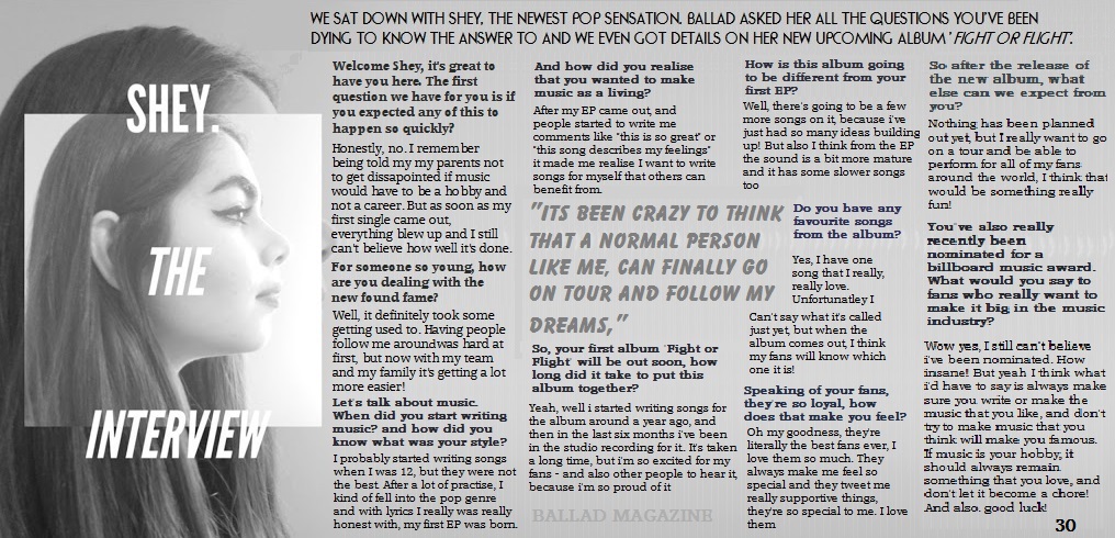
FINAL MAGAZINE!!


Pop Identities

Shey

Gender: Female
Age: 15
Location: UK
Occupation: Singer
Music Genre: Pop
Number of singles: 3
Number of albums: 1


Shey was born and raised in the heart of London with an unstoppable passion for music. By the age of 16 she had been around England in search of possible labels she could get signed to. Finally before the end of the year, she was offered a record deal that helped release her first album "Fight or Flight"

Shey's music is mostly songs that you'd find in the charts, pop with some RnB
Many of her songs are upbeat that are easy to have a good time to, however Shey has a couple of songs that are slower and more heartfelt.

She has a style than can be recognised by most teenage girls, She enjoys to wear simple clothes, but likes to glam up when she gets up on stage. Shey enjoys simple activities such as hanging out with friends, reading and most of all singing and writing music.


Friday, 4 December 2015

Good and Bad Magazine Covers


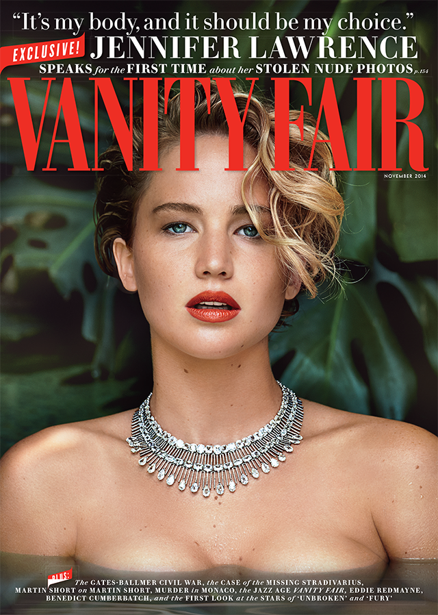
Whilst doing research for my own magazine, I came across some really good examples of what a magazine should look like, and how well they would sell, but I also came across some really awful examples of published magazine covers filled with mistakes.
This first magazine cover was published with a photograph of Kristen Stewart. This has to be one of the worst magazine covers because of the way she's standing and her facial expressions make the magazine look dull and not very exciting. It may be easy to guess that this magazine might not have sold as many copies as one of their issues with a slightly more awake model on the front.


 The Glamour magazine is also such an obviously bad magazine cover because of the way the model has been photo shopped, if you look at the model's right leg, you can notice how it is much smaller than the left leg. This is something that I will have to keep in mind when doing my own magazine. If I need to edit my photograph in any way, I will try to do it subtly and not make publish any big mistakes that will make my cover look unprofessional.


However, there are many good examples of well made magazines that I've looked at to compare my magazine and use them as inspiration on how I should try to make mine.
For example, this cover of Angelina Jolie includes many of the typical magazine front cover features and the photograph suits the style of the magazine, as well as not having any edited mistakes left in the final published copy. The magazine also looks professional and the colour schemes all match. The black, white and grey give it a simplistic style, which is what I am aiming to produce for my magazine.


Photo-shoot

For my first photo-shoot, I wanted to have a darker background so I could use the light from the street lamps as an effect. We visited a couple of locations, where I took some practise pictures for what I might want to use for the front cover as well as the double page spread. At the end of the shoot there were a couple of pictures I thought would be effective, one of them did end up to be on the front cover.
I also did another shoot with a lighter grey background. I found that I wanted my magazine's theme to be black and white, so I kept with taking pictures using that effect. I wanted the lighter pictures to show more of the models face, which compared to the darker images would have a good contrast. For the second photo-shoot, I used actors headshots as inspiration, and I wanted my model to be fully facing the camera, with nothing hiding her features.
After taking all of my pictures, I experimented with some colour filters, such as a blue effect and sepia, after doing so I found that the simple black and white ones were more effective and looked more professional. I took a couple of pictures only capturing my models eyes and half of her face because I wanted to experiment with slightly more unconventional styled pictures.
Although I really liked the pictures, after asking a few people it became clear that those type of pictures would not fit in with my genre of magazine.


Tuesday, 1 December 2015

Planning my Magazine

Before I start to make my final magazine pieces, I wanted to play around with a few ideas I had to see if they would work, and which software I would be able to use to give the best outcome.

Front Cover Ideas


Contents Page Ideas


Double Page Spread Ideas


Friday, 27 November 2015

Mood Boards + Research

Fonts


For the font, I was thinking about going for something that could found on other popular magazines. I preferred the bolder styles of font and I thought that if I were to use a more thinner font, I would use all capital letters in the title. By researching different font types, it has helped me to better understand the conventions of a magazine cover that is aimed at a mass audience and to choose the right font that would fit my genre of magazine.

Artist Genre


These are the kinds of artists that inspired what my model would look/be like. The fact that I had chosen a pop based magazine, I wanted to base my artist on well known chart singers, such as Justin Bieber, Taylor Swift and Ed Sheeran, all artists that would attract a younger audience. All of these singers are also mostly pop singers, which is what my artists would be similar to. This research also helped me to form content for my double page spread, by finding out what kind of questions these artists are asked and the way they go about answering them, helped me to put my questions together and to then form a response.

Location


 For the location, I wanted to visit mainly outdoor places so I could use a natural background without having to edit it. Even though many of the places I wanted to shoot looked nice. However from this research of different locations, it became clear to me that if I wanted to have the main focus of the magazine cover on my model, a noisy background would take away the effect of the model. For this reason I decided to still use an outdoor background, but in a way that it was subtle and would not take the audiences attention away from the model.

Music Magazine Covers

Many of the magazine front covers I researched were pop, or loosely based around pop culture. One thing that helped influence my final product is the way pop magazines layout their cover lines. I noticed that the main cover line would generally involve the biggest story (almost always about the featured music artist) and the other cover lines would give more insight into the rest of the magazine. One other thing from the research that helped my decisions on how to  make my front cover, was the position of the title. In my first magazine daft the title was a small size and spaced out, but after looking at other pop magazines, I realised a more effective and professional looking title would be bold and large, either in front of the model or behind.

Layout Ideas


Monday, 16 November 2015

Reader Profile

Demographics

Gender:                          Female
Age:                               17
ABC:                             C1/DE
Occupation:                   Student/Part time Job
Disposable Income:      £100
Education:                     Sixth Form/A Levels
                                      Media
                                      Politics
                                      English
                                      Psychology
Nationality:                   British

Psychographics

A "normal" 17 year old A level Sixth Form
student who is interested in music as well
as her hobbies such as photography and sports.
When she spends time alone, this person will
listen to mainstream pop music, but is open to
finding out about new artists other may not
have heard of. When she spends time with her
friends, they like to go to the cinema to watch
new movies or to the theatre to watch live
productions of well known performances.
She enjoys a lot of things to do with art and creativity.
She plays a few instruments and likes to paint
in her spare time, when she is not doing school work.

Likes: Good music and films, shopping,
playing instruments, spending time with friends,
CD collecting.

Dislikes: Racism, injustice, bad music
and films, people shouting in public.


Wednesday, 11 November 2015

Magazine Questionnaire

Thinking about my magazine, I made a questionnaire to find out about what kind of features and components my target audience would want to see. I conducted 20 questions that would help to give me an idea on what I would put in my own magazine, and how I would construct it so that it would fit to the expectations of the readers.


Ages

After doing some research, the main age group I was focusing on were 15-19 year olds. However as I progressed in handing out the questionnaires, I found that the majority of the people answering my questions were 16 and 17 year olds. From the pie chart, I can see how out of the 21 people who filled
out my questionnaire, the majority were these to ages. This will now help me to focus on the kind of language, and way I will construct my magazine in order to appeal to the correct age range. 


Circulation

One thing I wanted to find out from my questionnaire, is how often people would want to buy my magazine. The reason I asked this question was because I would have an idea on how much content the magazine would need, for example, if I was updating the readers on the past week, month or year. Looking at the results of this question, it became clear that 10 people out of the 21 would be interested in buying the magazine monthly. From these results, I will be able to keep in mind that in the magazine, the content will be about music that has been around, or made an impact in the past month.


Magazine Genre

Another very important question I asked in my questionnaire was: What is your favourite music genre. By asking this question, it would help me to use the results from the age question and the results from this to put together the ideal magazine. After collecting the results from this question, I can see that "pop" is the most popular genre. Amongst the 21 people who filled out the questionnaire, 18 of them fell under the ages of 16 and 17, from this I can put together that the majority od people this age like to listen and read about pop music.


The Magazine Name

The last major question I wanted to ask was about what I could call my magazine. Out of the 4 options (Tune Magazine, Ballad, Key Magazine and Root Magazine) the most popular name for the magazine was "Ballad". Since over half of the people I asked chose this name, I have decided to consider using this as my title because it was the most liked and being one word, it will stand out and look good.


 Other Questions I asked

As well as these questions that I put into pie charts, I asked more that I believed would help me to put together my magazine. One question that I thought would be important to ask was "What would you want to see on the front cover?" The reason I asked this question was so I could decide how I could construct the front cover of the magazine. The most popular answer out of the options I gave, was a celebrity. This will help me to decide what kind of picture I want to put on the front of the magazine.
 
One other question I asked was about the layout. I wanted to know whether people liked the conventional magazine cover or wanted to see something more unconventional and different to what most magazines are like. The most frequent answer was conventional, this will help me to design the cover in a conventional way that most people are used to.


Sunday, 18 October 2015

David Carson - Ray Gun Magazine


.
David Carson is best known for his designs for the front cover of the alternative music and lifestyle magazine Ray Gun in. The magazine sold over 70 issues from 1992 - 2000, featuring famous music icons such as: Oasis, Radiohead, Red Hot Chilly Peppers and Pearl Jam. One thing that would gain the attention of the public eye, would be how unconventional Carson's magazine covers were. His magazines explored a very abstract style. A lot of the time, most of the magazines were very hard to read.


Many of Carson's designs were different every time the magazine was published, and never had any of the same features. Looking at some of the front covers, we can see how the magazine doesn't include the typical features you would expect it to. For example, most covers wouldn't have any sort of cover lines or datelines. Another component that goes against the conventional magazine cover, is how in some of the magazines, Carson puts the barcode in different places, not always in the usual right hand bottom corner


Even though I do like how David Carson was able to design these Ray Gun covers, in a very non traditional way, I don't think I would try to make my music magazine cover this way. As David Carson was well known for his covers, it seems that he could design them however he liked, however if I tried to do the same thing, missing out all of the conventional features, I don't think the magazine would sell and be something people would immediately want to buy.


Thursday, 15 October 2015

Representation


  Miss Representation


After looking at different magazines and exploring how men and women are represented, there is a clear difference. For example, we look at front covers of magazines and we can immediately see how the men are portrayed as strong, tough and macho, when women are pictured as gentle, but more often as objects. GQ is a well know respectable magazine, however we can see how the woman on the front are clearly photographed as a spectacle for men to look at. As there are so many other magazines that do the exactly the same thing, it's not a surprise that in 2011, 53% of thirteen year old girls are unhappy with their body, because they have an unrealistic idea of what women and girls should look like. Even women who are known for their respectable jobs in the world, such as politicians or news presenters, are still sexualised and are only talked about when referring to their clothing and appearance.


After watching the documentary "Miss Representation" it has become even more apparent to me how women are seen as objects, and something of much less value than a man. It's not a surprise to anyone that we today, live in an extremely patriarchal society. However after watching the documentary, what did come as a surprise to me was that, in 2011, only 16% of protagonists are women. Even then, the women in these movie roles are sexualised and are made to be desirable for a specifically male audience. Not even in children's movies are portrayed differently, but are still seen wearing a significantly small amount of clothing.
 

Facial Expressions - Marjorie Ferguson

In the 1980's Marjorie Ferguson identified four different ways in which women are shown in British magazines. Ferguson showed how magazine covers could be shown as: Chocolate Box, Invitational, Super Smiler and Romantic or Sexual.

 
The Chocolate Box
This cover is usually shown with the model with a closed mouth smile, and has used a full or three
quarter face to the camera.
The cover would normally try to project a feeling a warmth, as well as showing the model
with nothing but perfections. 

Invitational
This cover typically has a big emphasis on the eyes or the mouth of the model. Usually, the models
body will be turned away, but their face facing the camera. With this cover
there is a projected mood of mystery. The smile would often create a sense of sexuality
 
 
The Super-Smiler
It wouldn't be surprising to find a windswept model, showing a full tooth smile
with their chin up and a very aggressive "look my way" type of mood. 

 
Romantic or Sexual
This cover would normally include more than one person on the front, typically
a male and a female in a very sensual position. The models would not be smiling
and look. The models would have less clothing to seem "available"

The Male Gaze Theory


The idea of the Male Gaze Theory came about in 1970 by a woman named Laura Mulvey. Mulvey strongly argues that in film, women are only present for the masculine eye to be gazed at and objectified. Her idea suggests that in film, the camera would act as the eye of a heterosexual man who would want to show women the way men want to see them. 
Mulvey shows us that this can be shown as:
 
Men look at women
Women look at Women
Women look at other Women

In movies, there is no other way that women are shown apart from sexual characters, innocent characters, or the incredibly bitchy boss. In so many movies, you will find that whatever the genre of movie, if there is a young female character, the camera will just so happen to find itself positioned on the women's slightly clothed body for the rest of the movie, simply to make sure the men are happy. This has become so normal in our society that nothing about this theory is questioned, and since film was created no one in the directing career has changed the way we victimise women and put them in front of the camera to just be looked at.


For my magazine

After looking at how men and women are represented in the media, I can see how it can be difficult for editors to create work that will stand out in the market as well as producing a magazine that won't have to follow along the steps of a "typical magazine". For my magazine, I don't want to put out the same messages as all of the other magazines, that would only create false image for both girls and boys. If I were to have a woman on the front of my magazine cover, they wouldn't be presented in a way that is only desirable for men, but in a way that other women and girls will be able to relate to. I would want to show that women can be just as powerful as men, and maybe not use the typical functions of magazine covers such as Marjorie Ferguson's facial expressions, that would make women seen differently to men. I would want my magazine to be able to represent all kinds of people, and would not just use a white female who would attract the attention of white males. I want to make sure my magazine can appeal to any sort of ethnic group.